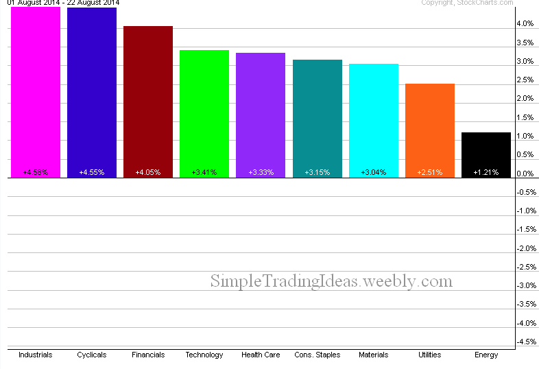
The chart below shows that all nine sectors of the S&P 500 are in the black this months. Industrials, Cyclicals and Financials are the leaders, Energy and Utility sectors are far behind.
| Simple Trading Ideas |
|
|
The chart below shows that all nine sectors of the S&P 500 are in the black this months. Industrials, Cyclicals and Financials are the leaders, Energy and Utility sectors are far behind.
0 Comments
The performance chart below shows that the Cyclicals sector and the Utilities sector performed the best with the Technology sector and the Health Care sector not far behind during the past week 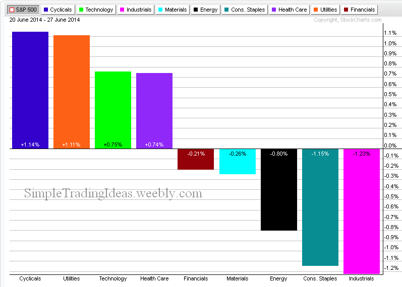
The chart below shows how the 9 sectors performed relative to the S&P 500 during the past week. The Offensive sectors clearly outperformed the S&P 500 and the defensive sectors were lagging. 
The performance chart below shows the Railroad, Trucking and Delivery Services indices during the past three months. These three indices are components of the Industrial Sector. All three of them are in an uptrend. This shows a healthy economy where there is a need to transport all the unfinished and finished goods between suppliers and customers. 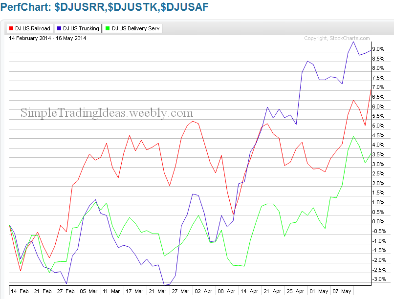
The consumer staples sector has been one of the strongest sector during the past three months. The performance chart below shows 9 stocks in this group during this period. They clearly outperform the S&P 500, shown on the right. 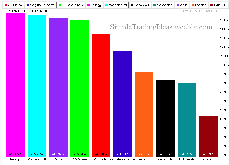
As offensive sectors declined money was rotated into defensive sectors. During the past month the utility sector was especially doing well. The market carpet below shows how the utility stocks in the S&P 500 performed during the past month. When the utility sector loses leadership that would be a sign that the equity market found a firm support. 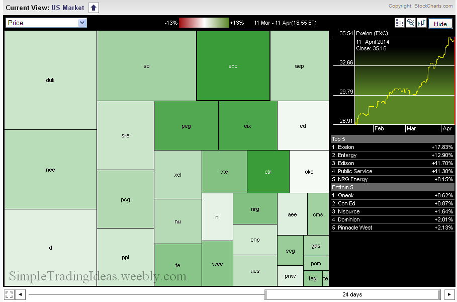
The performance chart below shows the nine sectors of the S&P 500 with the S&P 200 ETF, SPY. As you can see SPY didn't go anywhere during the past month but four sectors, the financials, utilities, energy and consumer staples showed strength. On the downside health care and cyclicals where the weakest. 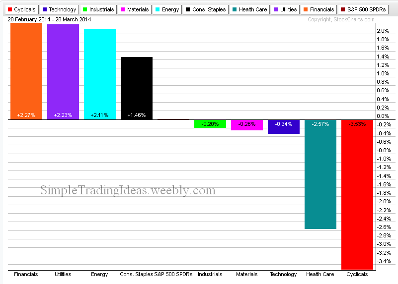 The daily chart below shows XLV, the Health Care Select Sector SPDR. Below the chart you can see the relative performance to the S&P 500. XLV clearly outperforms the S&P 500. The Health Care Sector was the strongest last year too, in the past year it gained over 38%. 
The chart below shows the performance of the S&P 500 nine sectors during the past week. The offensive sectors are outperforming the defensive sectors. 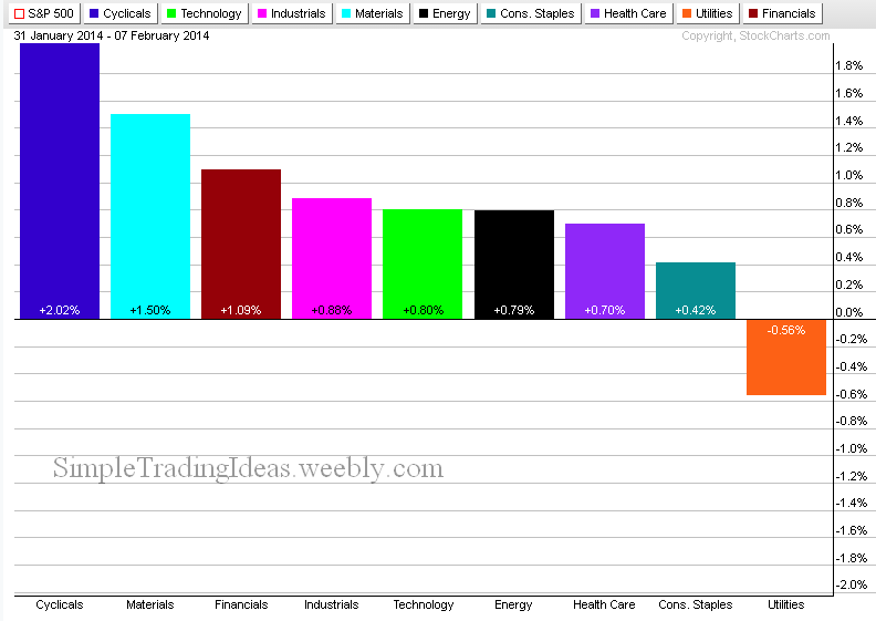
The performance chart below shows how the 9 sectors performed relative to the S&P 500 during the past year. Offensive sectors were doing good which is healthy for the stock market. 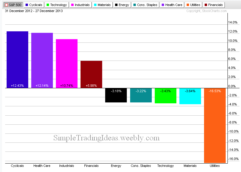
|
Loading
Search Site
Links
Archives
September 2014
Categories
All

|
 RSS Feed
